Friggy · Product Design · Consumer App
Friggy —
A Book Summary App
Designing a personalized reading app that stands out in a crowded market — by putting audio-first experience, habit formation, and personalization ahead of generic content feeds.
Role
Product Designer (pair with 1 designer)
Team
PM, 2 Designers, Developers, QA, Graphic Team
Status
Live on iOS

The problem
The market was crowded — but missing something
Apps like Blinkist and Headway had already proven the demand for book summaries. But they treated users the same — same feed, same recommendations, same experience regardless of goals or preferences. The opportunity was personalization: an app that felt like it was built for you, not for everyone.
Research
What we learned early
We started with competitive analysis of Blinkist, Headway, and Bookmates — mapping their strengths and gaps. We combined this with quick corridor testing to gather early reactions from real users.
01
Users dropped off after 1–2 summaries
Without a clear next step or personal recommendation, non-paying users had no reason to come back.
02
People preferred listening over reading
Audio consumption was significantly more popular — but most apps treated audio as a secondary feature.
03
Users didn't know what to read next
Strong demand for personalization and guidance — not just a catalog to browse.
Process
Moving fast with a clear framework
To move quickly and stay aligned across two designers, we built a shared UX framework early: a user journey map based on reading motivation, a prioritization matrix to scope the MVP, and weekly design-engineering syncs with early prototypes tested internally to validate flows before building.
Solution
Designed around clarity, focus, and habit
Every feature was designed to answer one of three needs: help users discover what to read next, make consuming summaries effortless, and give them a reason to come back tomorrow.
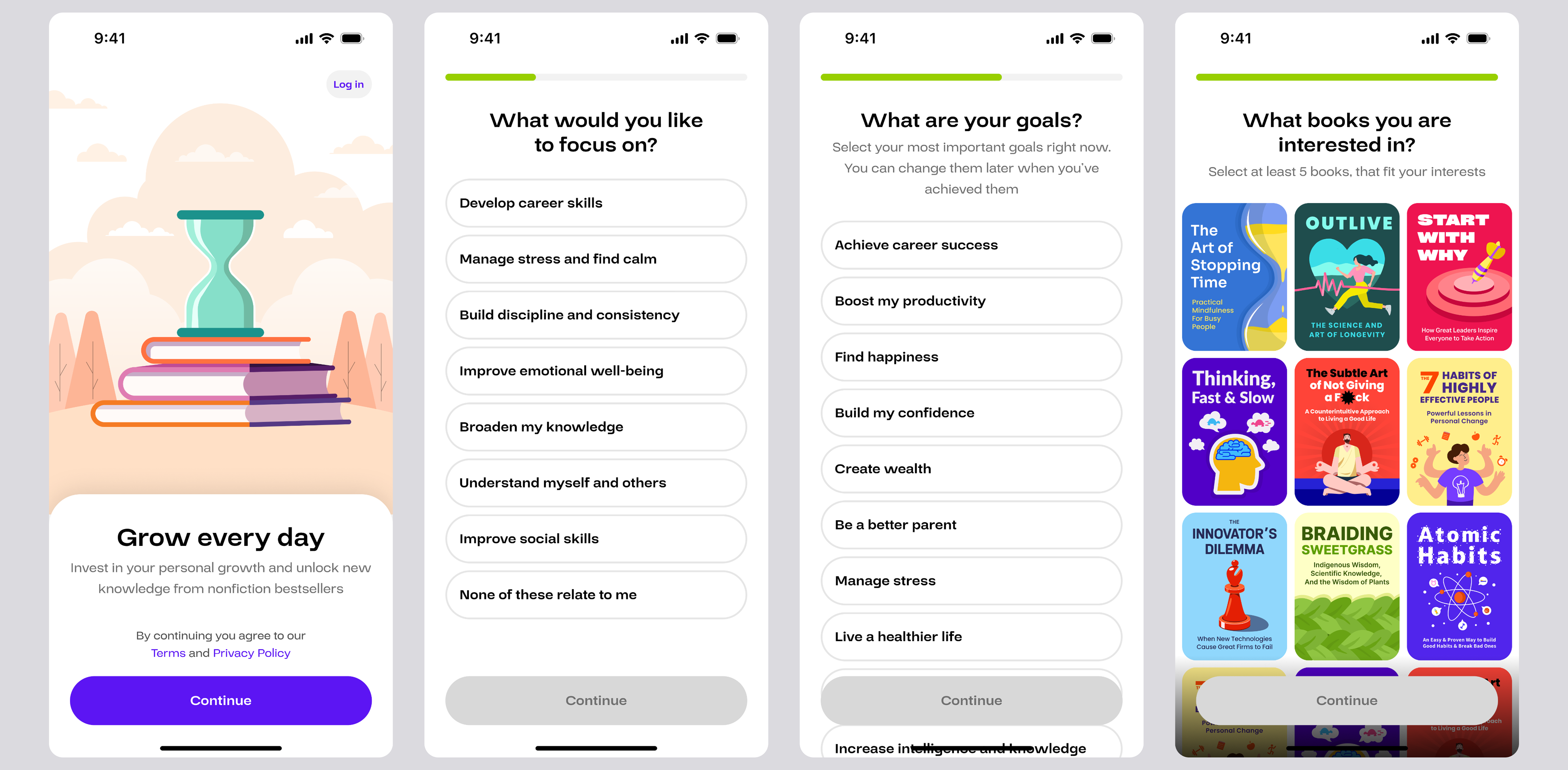
Users select focus areas, set personal goals, and choose books that match their interests. The onboarding flow builds a reading profile that shapes every recommendation going forward.
Outcome
Live on iOS, preparing for growth
Friggy launched on iOS and is now live for early users. The MVP was built around audio-first experience, personalization, and clarity — shaped directly by our early research findings.
The next stage focuses on A/B testing the onboarding flow with a goal of increasing trial starts — applying the same growth experimentation approach used in previous projects.
Key learnings
What I took away
01
Audio-first is a UX decision, not a feature
Treating audio as the primary consumption mode — not an add-on — changed how we designed every screen. Player UI, navigation, and content structure all followed from this one decision.
02
Habit requires a hook, not just content
The gamification layer wasn't decoration — it was the answer to the drop-off problem. Streaks and constellations gave users a reason to open the app even when they had nothing specific to read.
03
Lightweight testing beats no testing
Without budget for formal user research, corridor testing with colleagues gave us enough signal to make confident prioritization decisions. Imperfect data is still better than assumptions.